Can you make science out of art?
By Adinda van 't Klooster
Preparations for the live audiovisual concerts are progressing well. Yesterday during a rehearsal John Snijders and Nick Collins both played to the ‘In a State’ interface and it was really interesting to see the different interpretations/playing styles of the two most excellent improvising pianists of the North East. It was also the first time for me to hear John interpret the first graphical score I posted in an earlier blog. It was very inspiring to hear my drawing most originally transformed into piano waves and lines just as I had drawn on paper. John also has the most extraordinary way of treating the lower register of the piano, creating sounds that I have never heard come out of a piano before.
We have also been making progress on the second interface, as of yet without a title, that uses sensors that record physiological responses like heart rate, brainwaves and perspiration. The data will be used to estimate what the musicians feel during the performance. Using a subset of the eight emotions: happy, sad, tender, calm, excited, scared, angry and annoyed these emotions will be visualised through animated drawings. The findings of the online research survey on this site will directly influence the performance as it helps me to choose which graphics are best at expressing these eight emotions. The survey has so far been completed by 27 participants, but more participants are needed so please participate by clicking the participate button at the top of the screen.
Tuomas Eerola helped me make the very interesting graph below, which shows how similar the abstract 32 drawings in the survey are thought to be in terms of what they express emotionally, according to the 27 participants who so far participated. Using the survey results he was able to compute and plot the distances between the images using the eight emotions. The result is a two-dimensional projection of the similarity of the images in terms of emotions, in a familiar affective space using valence and arousal (Russell, 1980). The drawings overlap slightly where they are though to be more similar and when an image is bigger this reflects how clearly it was able to express the main emotion. Naturally an image like this poses many questions. Can we really make science of art in this way, i.e.: is it meaningful? I would say it is certainly quite useful to see if the message intended is also received even if it not always the aim of an artist to be clear about the meaning. Sometimes the aim is to be ambiguous and intrigue rather than to express something in a clear manner but it is certainly also interesting to see that abstract images can also be quite clear. I also wonder how this graph will change when more people take the survey. Do help us find out by taking the survey , if you have not already done so!
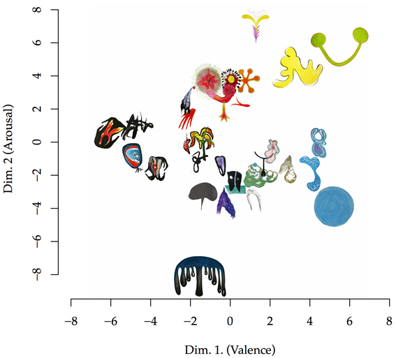 Image by Tuomas Eerola and Adinda van 't Klooster
References